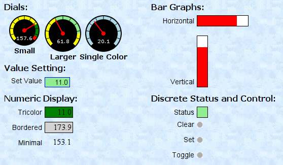
Widgets

From here on, we will describe the details of appearance and behavior for each widget type. Some widgets are passive. These can only display a value. Others are active - they can also set an element value in the Vesta controller.
In each case, the first five required parameters are not discussed. They are covered in a previous section and are the same for all widget types.
For each widget type, one or more examples will be shown along with the corresponding specification.
Color Specifications
Most widgets allow colors to be specified. In those cases, any valid HTML color specification may be used.
Multicolor Widgets

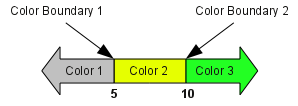
Many widgets can use multiple colors. In general, they all follow the same approach. If only a single color (Color 1) is specified, that color will be used - as the background color for a text widget, scale color for a dial widget, for example. For multi-color widgets, a 'color boundary' and second color value can be specified. In that case, if the displayed value is above the color boundary, the second color will be used for the widget background. In a similar way, a second boundary and third color can be specified.
In this example, three colors have been specified: lightgrey, yellow, and green. The two color boundaries have values of 5 and 10. That leads to the following behavior:
- For display values up to 5, the background is light grey
- For display values above 5 and up to 10, the background is yellow
- For display values above 10, the background is green
